

Leading Growth Design for Plooto
Timeline
Jan 2025 - Apr 2025
Role
Product Designer
Tools
Figma
Pendo
Team Members
2 Product Managers
1 Product Marketing Manager
1 QA Tester
1 Designer (me!)
Overview
During my winter 2025 internship on Plooto's product team, I focused on building contextual in-app experiences that boosted feature adoption and supported the company’s growth strategy. My role involved auditing existing user flows to identify friction points and designing a more persuasive path toward premium features.
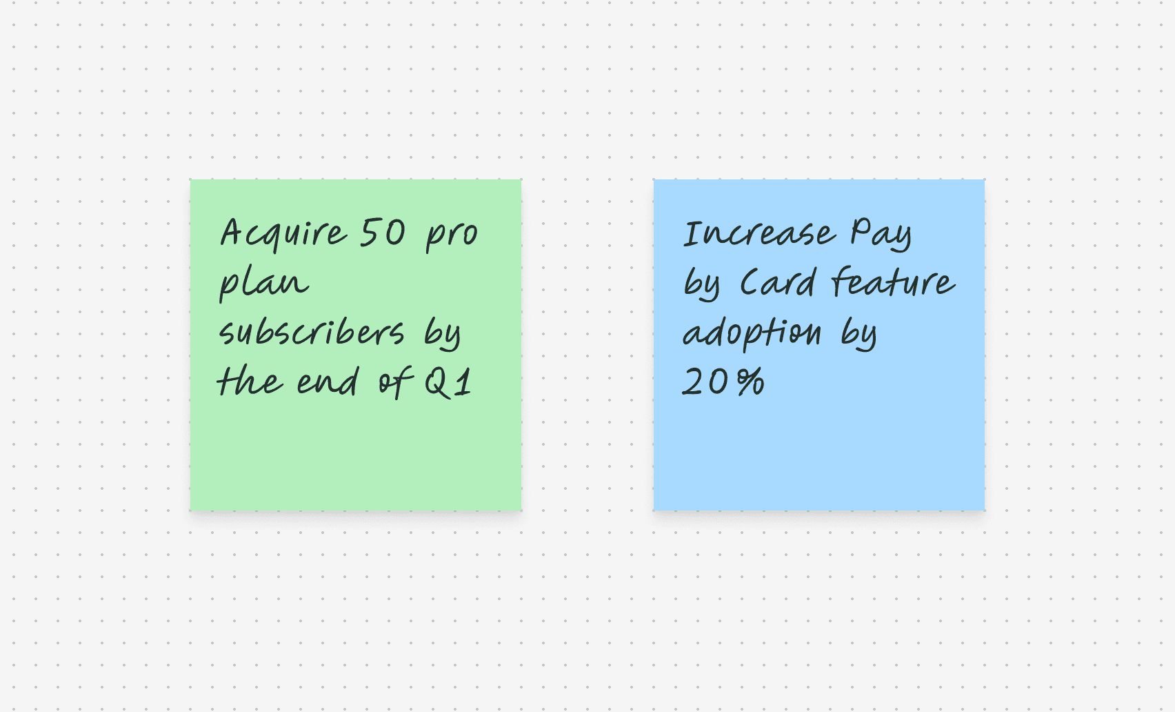
GOAL
The "North Star"
Success for this project was defined by two KPIs aimed at driving immediate revenue and deepening user engagement.
Solution
Increase Visibility of the Pay by Card Feature & Optimize the First Step
I built two touchpoints into user's frequent workflows toprovide education on the Pay by Card feature as well as a simplified path to complete the first step: adding a credit card.


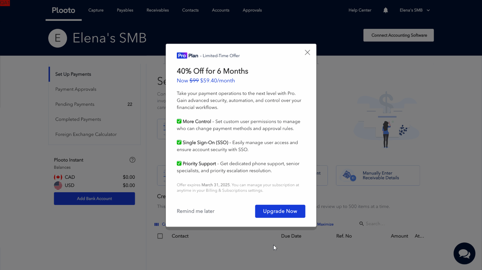
Pro Plan Promotion for Current Subscribers
Price sensitivity and uncertainty of Pro plan benefits were identified as the key barriers that stopped businesses from upgrading. I built and launched a promotional campaign during the month of March with support from the finance and legal teams.
outcome
I Helped the Product Team Smash Their Q1 KPIs
A pretty successful Q1, if I do say so myself :D

Learning
Design Resilience: Solving Problems with Limited Resources
Engineering resources were tight but we had a Pendo subscription! So… I taught myself this platform from scratch, built and launched the guides seen above myself, and ended up becoming the team's 'Pendo expert' by the end of the term.